
We’re tracking down the most bizarre food things we find in the deep, dark corners and bright shiny headlights of the internet. This week, as we sail into the official, sweltering days of summer, writer Eboni Harris hits blend on the strange and wonderful world of color-swatch-coordinated smoothies.
______________________
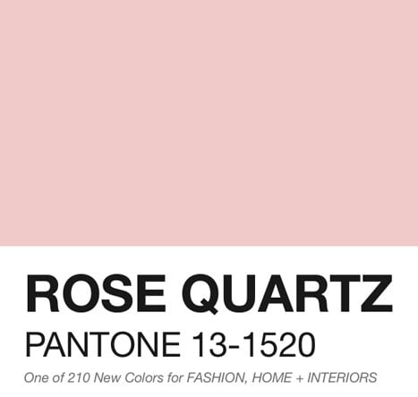
In 2016, for the first time ever, Pantone released not one, but two shades as its Color(s) of the Year : Rose Quartz , a cool shade of peach, and Serenity , an ice-blue, as the “It” colors for the upcoming fashion and design seasons. The fashion-savvy will be sure to keep an eye out for these tones in everything from clothing to home décor ; meanwhile, the food-savvy can check out Pantone Smoothies , a website dedicated to creating “tasty smoothies in any Pantone color,” for their own flavorful fix.
Created by Swedish art director Hedvig A. Kushner , the goal of the project is to create all-natural smoothies in every Pantone color—no small feat, considering that there are well over a thousand distinct shades. During the process, Kushner matches colored paper to Pantone swatches, then gets to work mixing up various ingredients until the color of the smoothie is just right. After creating an accurate and delicious blend, she then lays out the ingredients, the finished smoothie, and the Pantone swatch on the colored paper, so fellow art director, photographer and partner Michael P. Kushner can photograph it all. The result is an aesthetically pleasing fusion of art and food in the most literal sense, all documented on their website and Instagram .
Pantone and food have a history: in 2015, the Color of the Year was a rich, deep burgundy shade called Marsala . Based off of the wine originating in the Italian city of Marsala , the color was described as an earthy, full-bodied red (and was forever immortalized that year by Rihanna ). And of course, who could forget about the Pantone Cafe in Monaco? Food is also our first and favorite reference point in naming colors altogether, from cherry red to licorice black, orange to grape. Pantone smoothies are just the logical next step—because mixing up paint is far less fun than mixing up smoothies.


 Crème")

 Cookout")


